

Project
The Mercians
Deliverables
Information
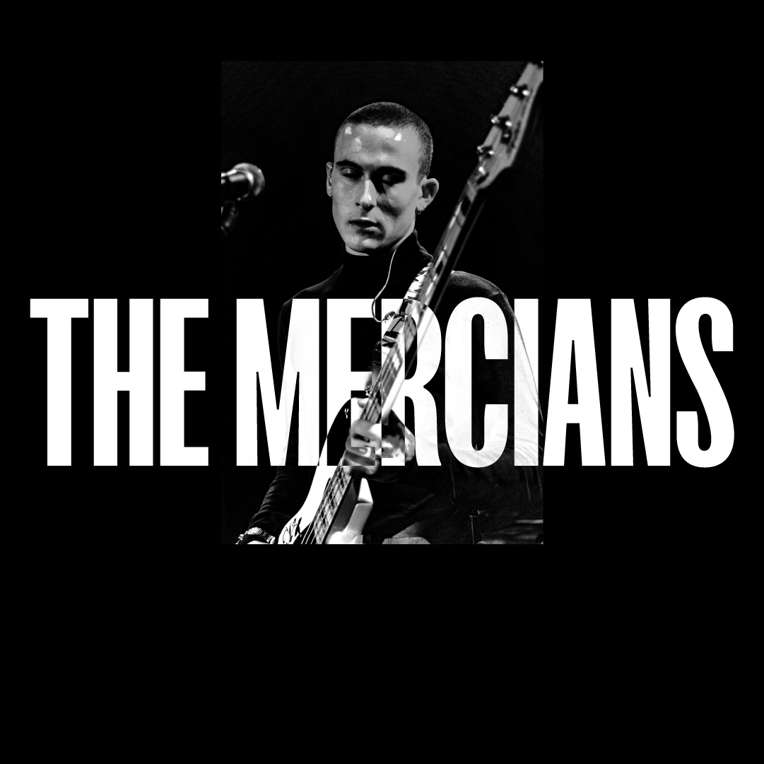
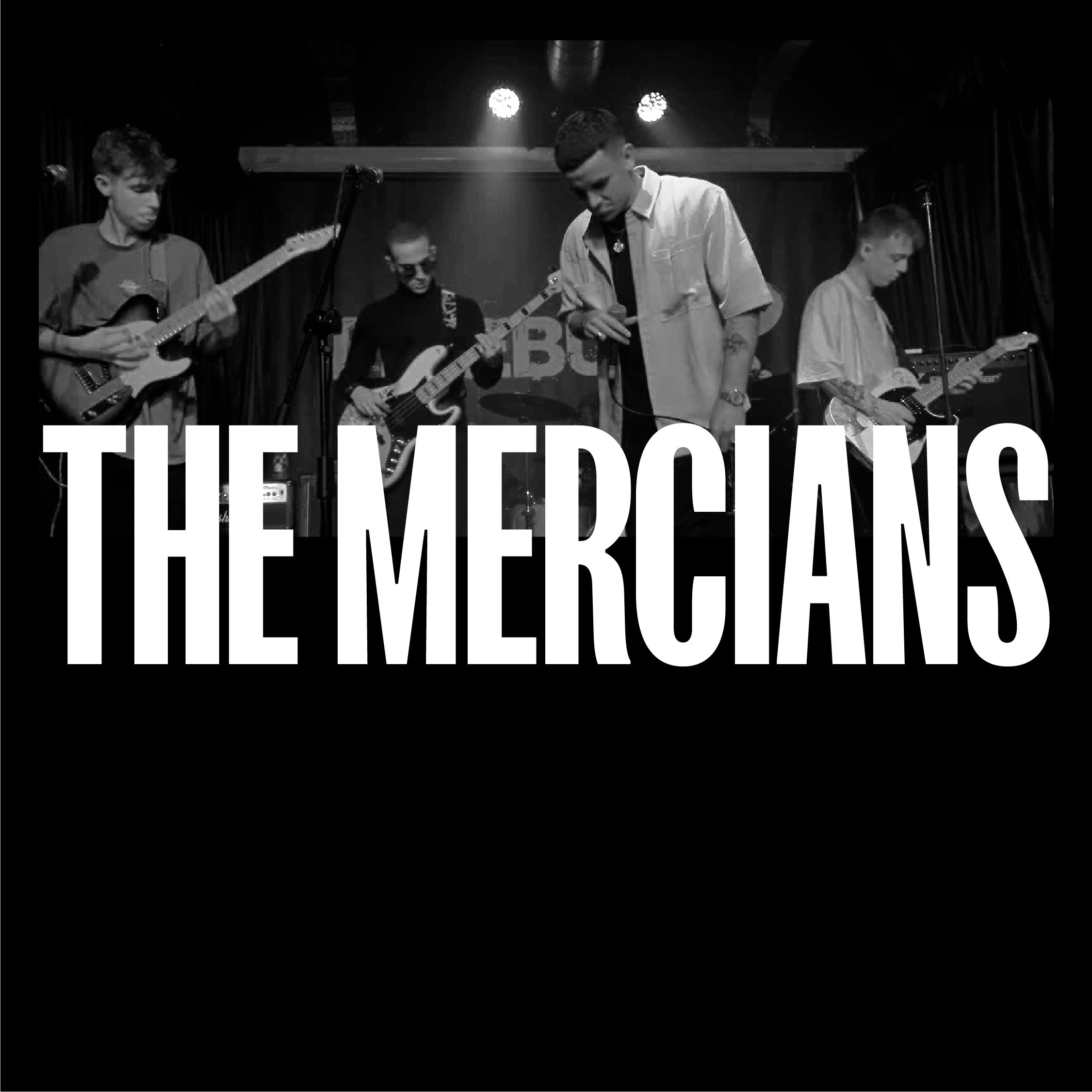
The Mercians are a midlands-based indie band. They were looking for a visual graphic language to represent their image and their music.
As a way of interpreting the band’s diverse range of personalities and sounds, I explored the idea of contrast. In its purest form, I found that contrast could be articulated visually through a strictly black and white palette. The intersection at where the two neutral colours meet and cross over then helped to form a brand style.
I developed a series of arrows and triangles to bring dynamism to the identity, and ultimately to reinforce the band’s location. I was inspired by the work of the Futurists, and how movement and energy can be emulated through shape.