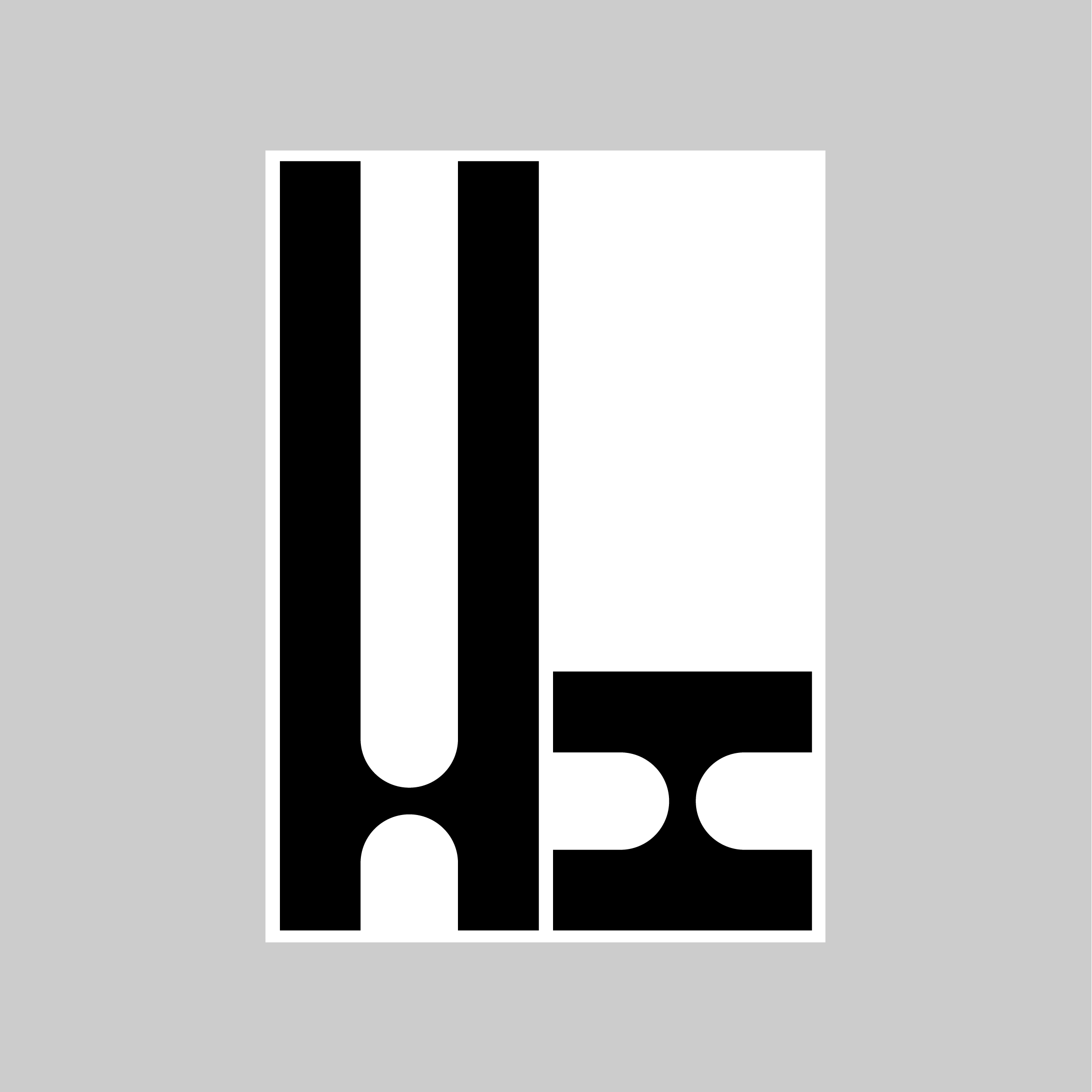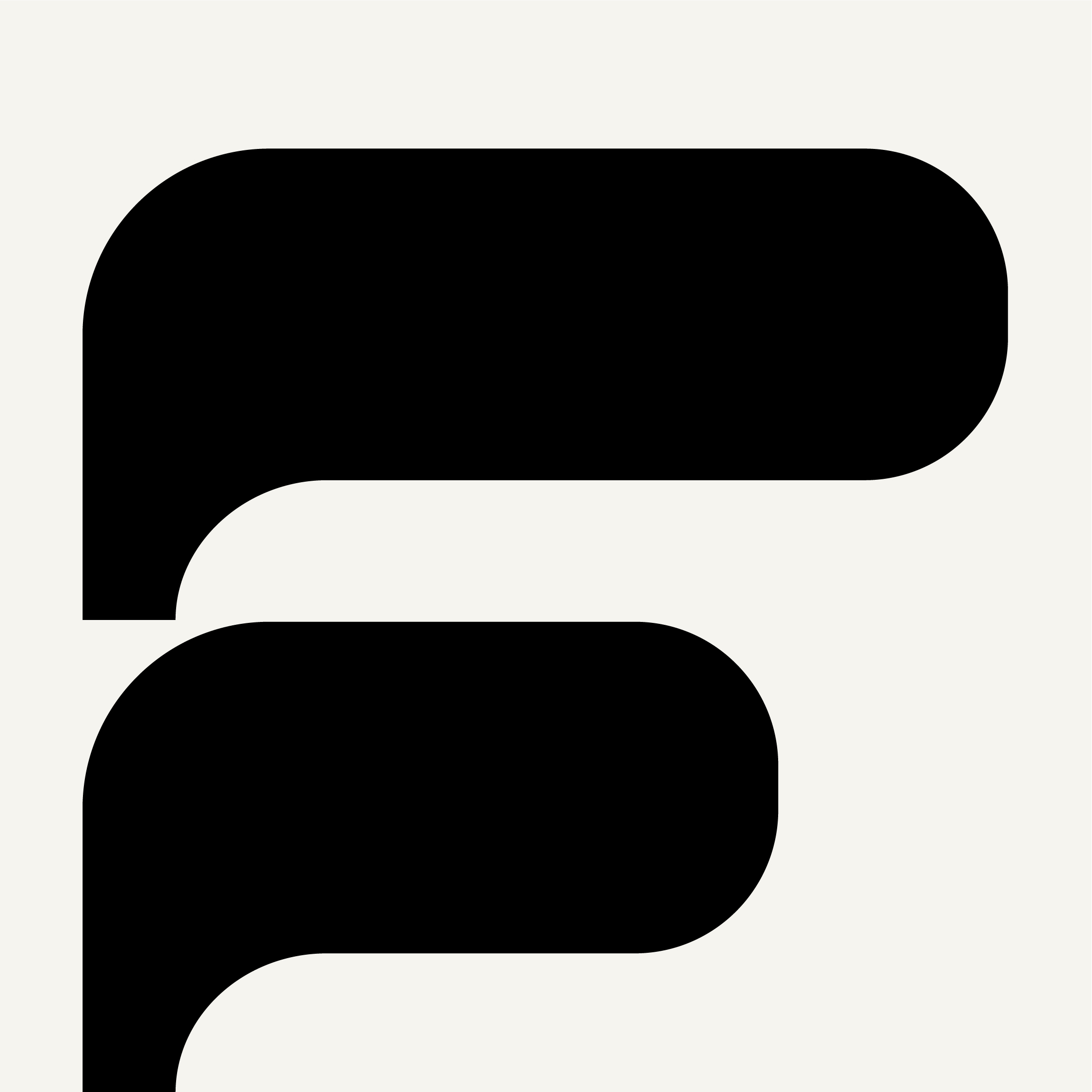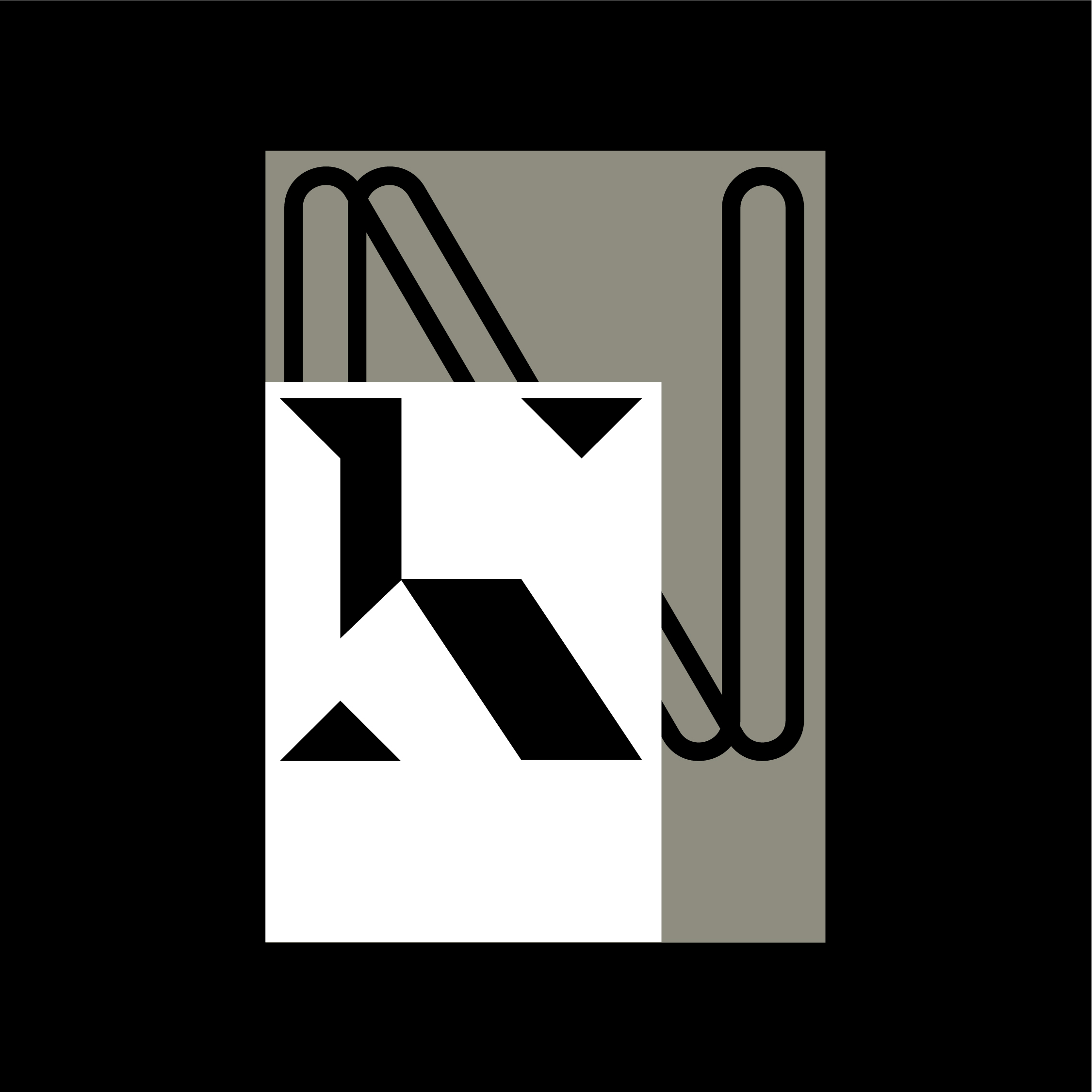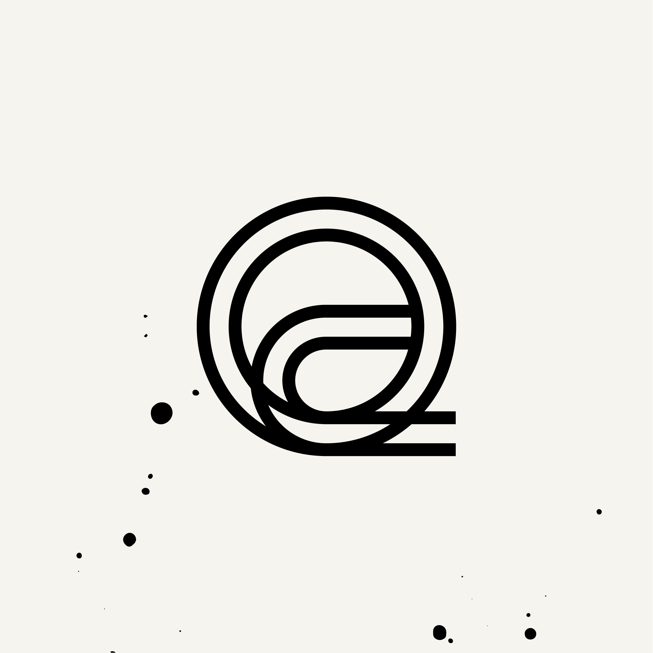
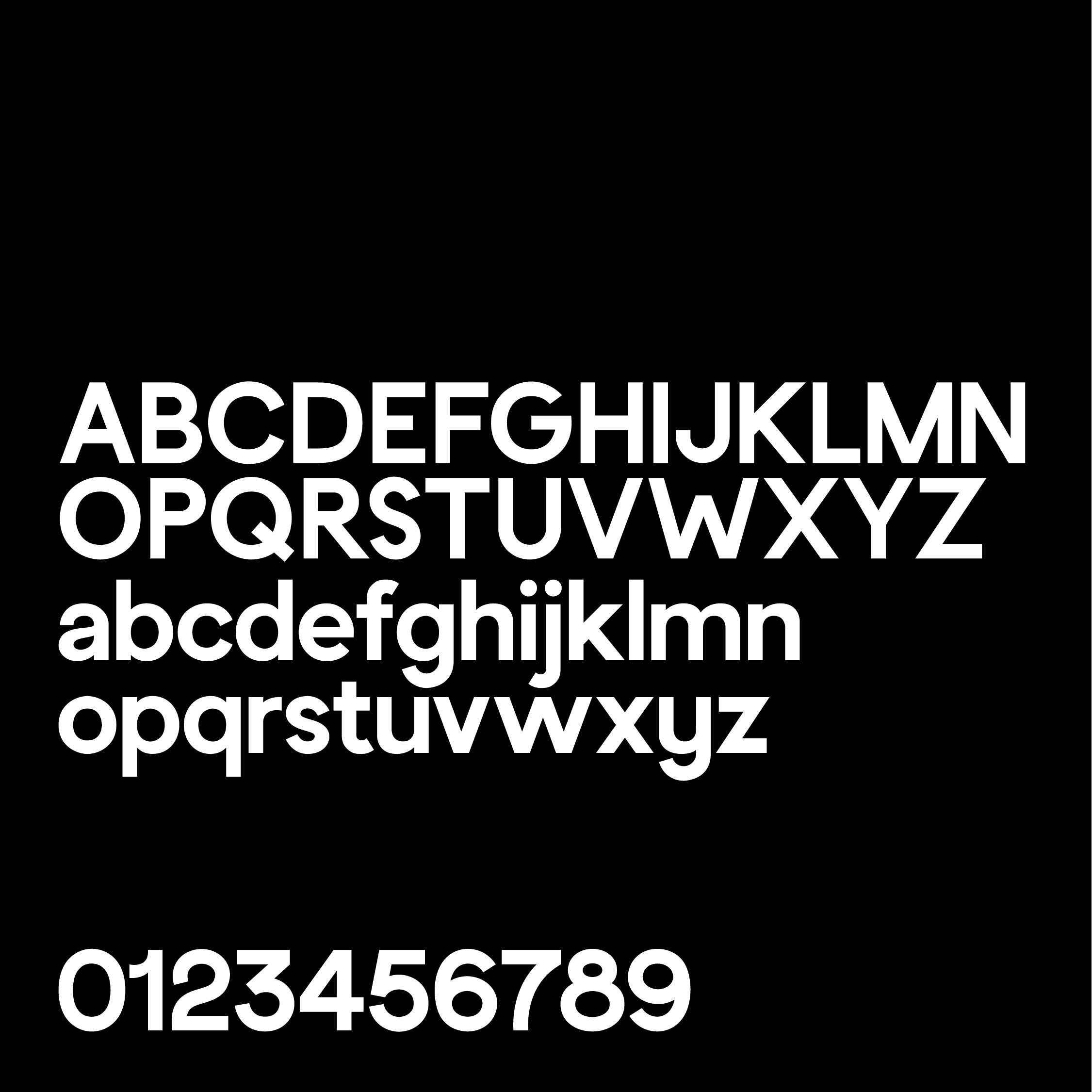
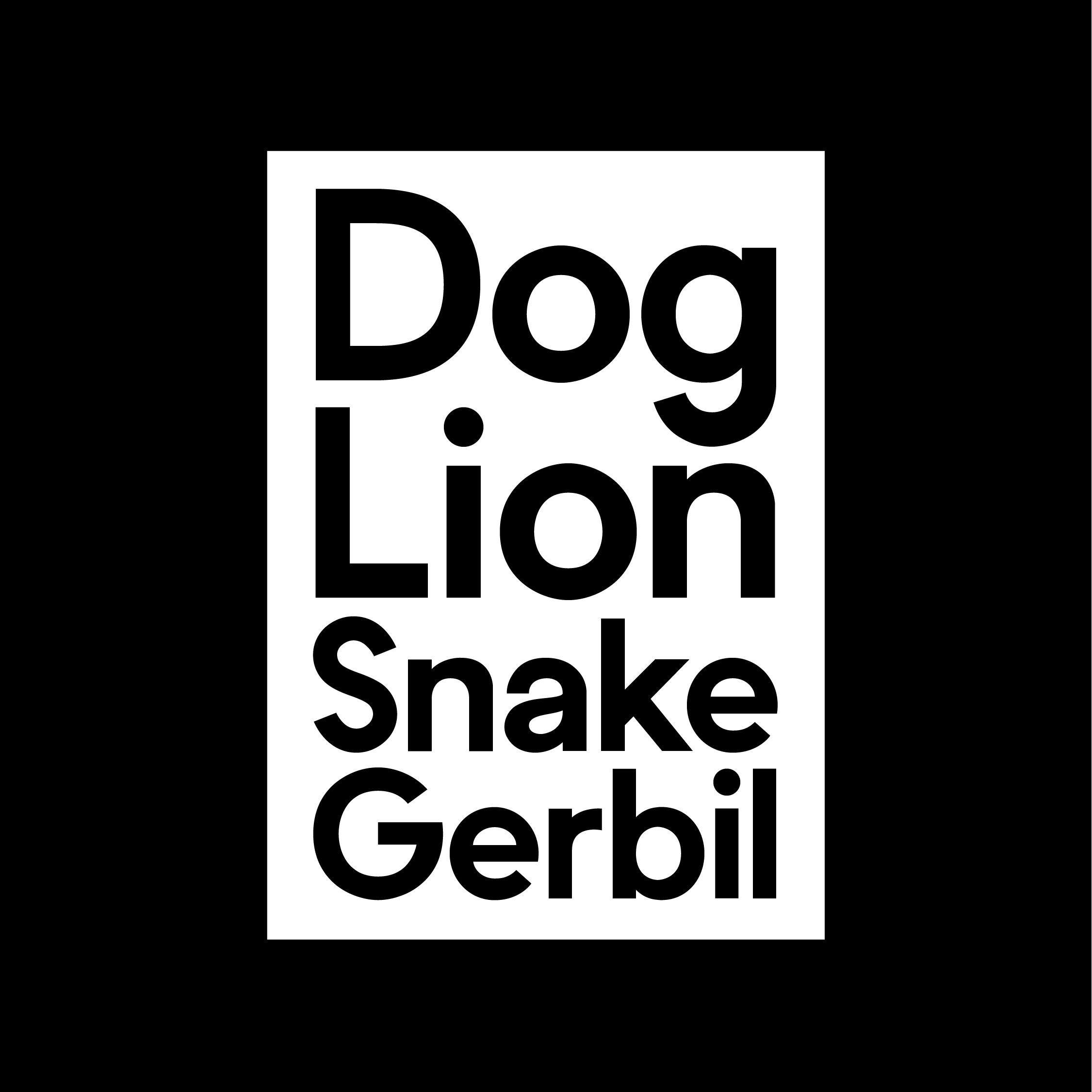
I started developing this working sans–serif as a way of understanding the complexities of structuring a complete typeface, figuring out how each character needs to interact with its adjacent counterpart in any given situation. This is still very much a work in progress, but it has allowed me to appreciate the finer details of designing type.
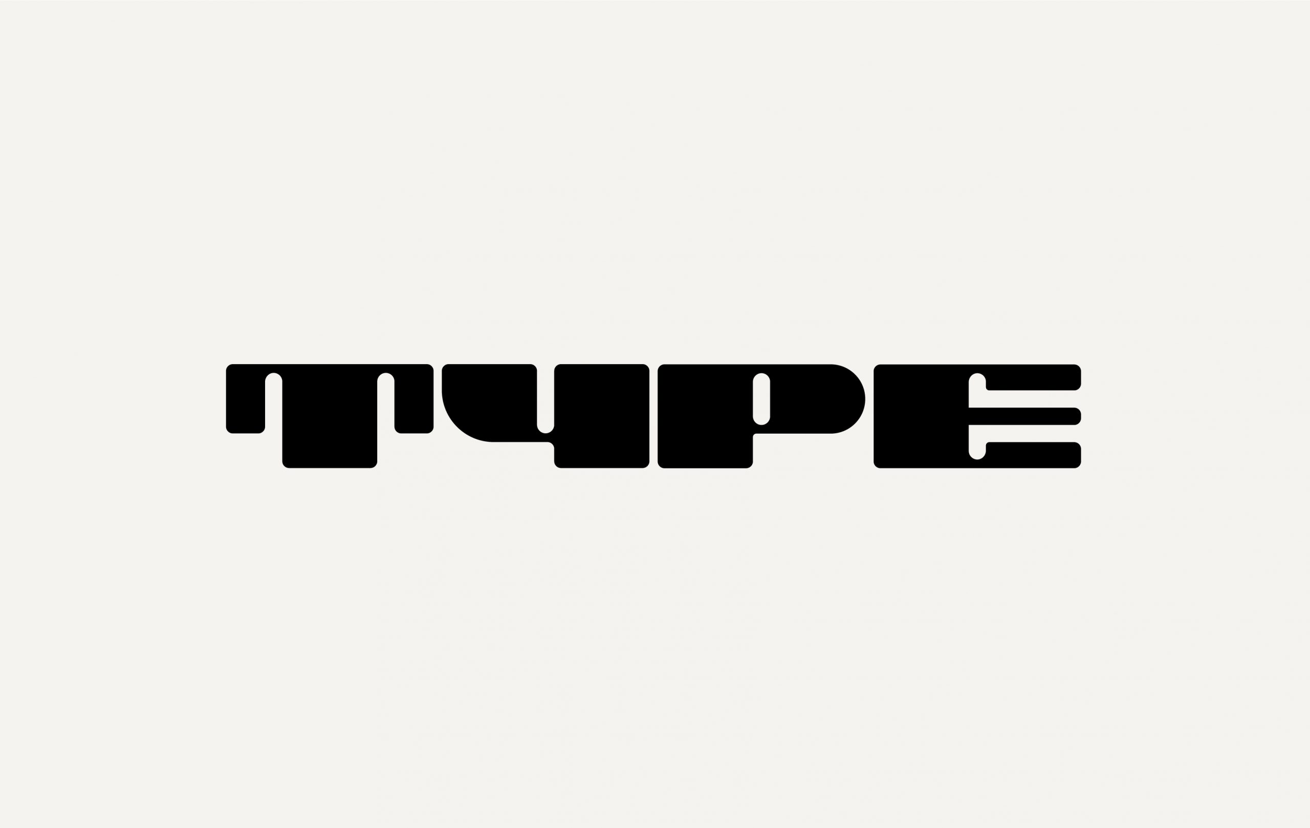
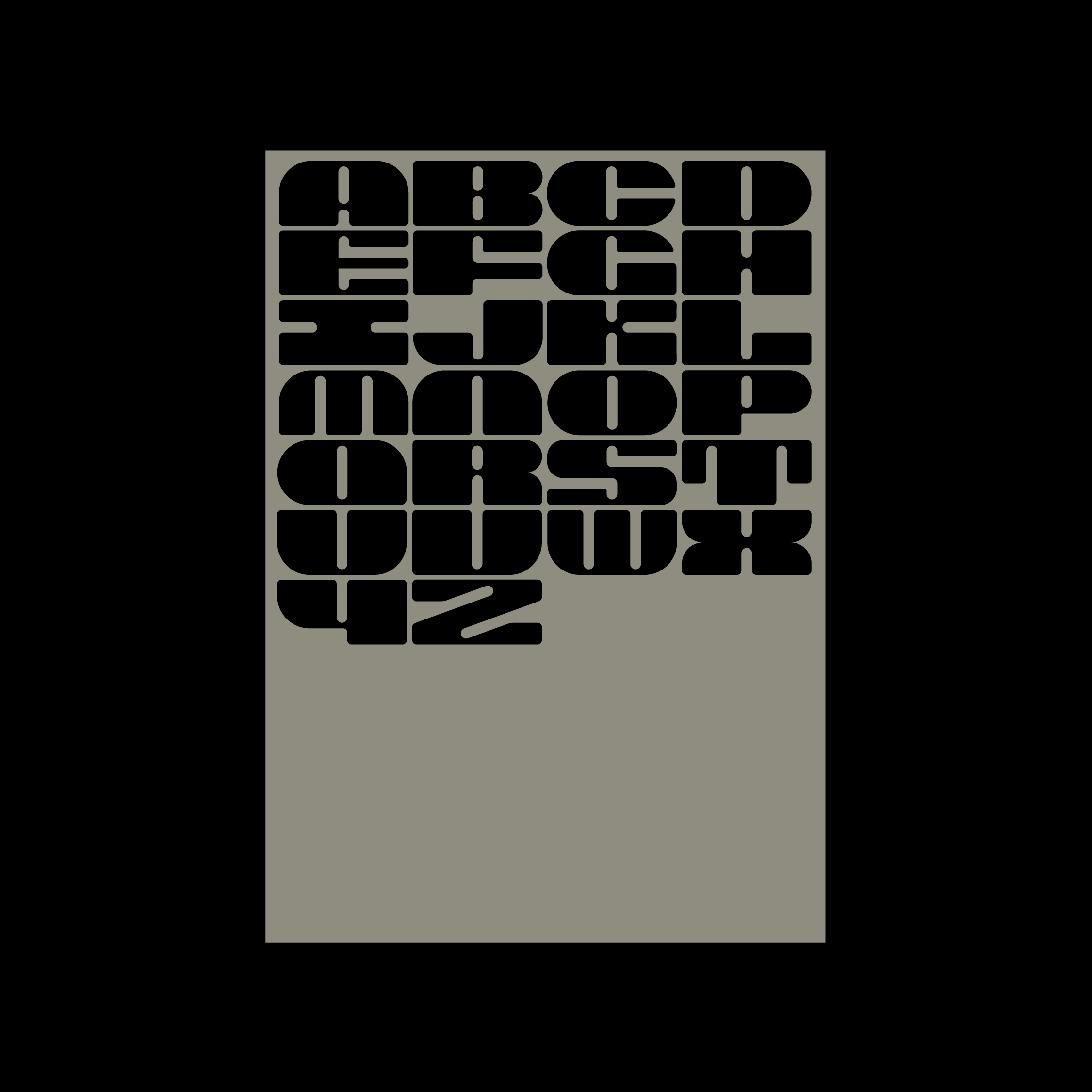
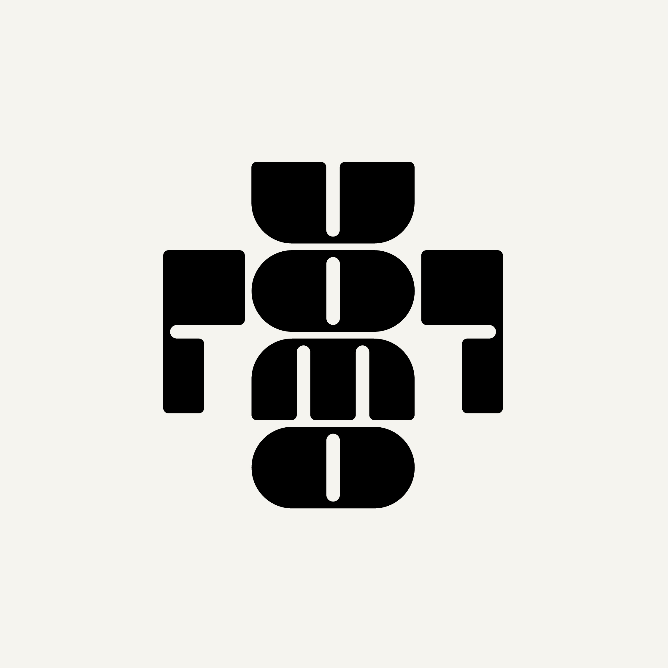
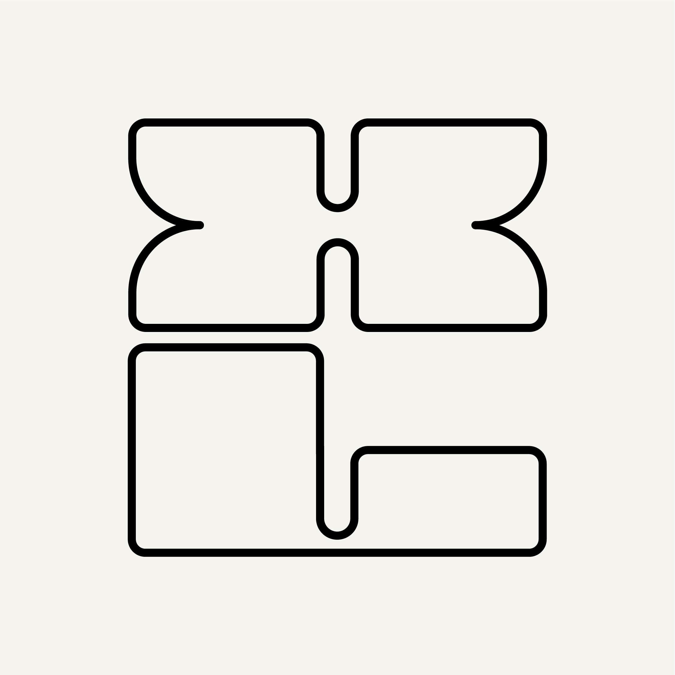
I drew this typeface from an unused logo for a client project. The initial designs were comprised of only a couple of characters. Using the letter O as a base, I built a grid system for completing the additional characters.
This following designs are a mix of bits and bobs from various client projects and personal development.

